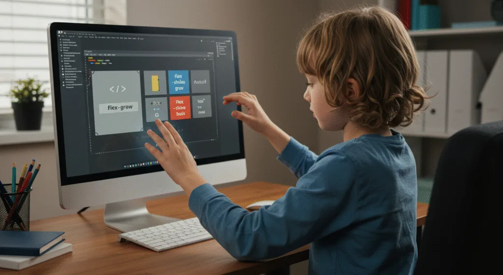
Let’s begin with Lecture 21 of the HTML5 & CSS3 series. Advanced Flexbox – Wrapping, Ordering, and Growing Items. This lecture is for absolute beginners; even kids can follow along and understand.
🎯 Objective:
By the end of this lecture, you will:
- Understand advanced Flexbox properties like
flex-wrap,order,flex-grow, andflex-shrink - Be able to control how items behave when space is limited
- Create responsive layouts that adapt to different screen sizes
- Make elements grow or shrink dynamically
- Build a flexible card layout that wraps on smaller screens!
🔁 flex-wrap – Wrap Items Onto New Lines
By default, flex items stay in one line. But with flex-wrap, you can let them wrap onto multiple lines.
Values:
nowrap– All items stay in one line (default)wrap– Items wrap onto new lines from top to bottomwrap-reverse– Items wrap from bottom to top
Example:
.container {
    display: flex;
    flex-wrap: wrap;
}
This is perfect for responsive card layouts.
🔄 order – Change the Visual Order of Items
The order property lets you reorder flex items without changing the HTML structure.
Default:
All items have order: 0.
You can assign any number — positive or negative.
Example:
.item1 {
    order: 2;
}

.item2 {
    order: 1;
}
Now .item2 appears before .item1 visually.
➕ flex-grow – Let Items Grow to Fill Space
Use flex-grow to make an item take up the remaining space.
Example:
.left {
    flex-grow: 1;
}

.right {
    flex-grow: 2;
}
This makes the right section twice as wide as the left.
🔽 flex-shrink – Control How Items Shrink
When space is limited, flex-shrink decides how much each item shrinks.
Example:
.item {
    flex-shrink: 0; /* Don’t shrink */
}
Useful for keeping sidebars or menus at a fixed width.
📏 flex-basis – Set Initial Size Before Growing/Shrinking
Think of it like setting a starting size.
Example:
.item {
    flex-basis: 200px;
}
Combined with flex-grow and flex-shrink, you get full control over sizing behavior.
🧱 Shorthand: flex
Instead of writing all three separately, use the shorthand:
.item {
    flex: <grow> <shrink> <basis>;
}
Common values:
flex: 1 1 auto– Default for most flex itemsflex: 0 0 200px– Fixed width, no growing/shrinking
💻 Try This: Responsive Card Layout with Flexbox
Let’s build a card layout that looks great on both large and small screens using Flexbox wrapping and growth.
Step 1: Create a New File
In your VS Code project folder (MyFirstWebsite), create a new file named:
flex-card-layout.htmlStep 2: Add This Code
<!DOCTYPE html>
<html>
<head>
    <title>Responsive Flexbox Card Layout</title>
    <style>
        body {
            margin: 0;
            font-family: Arial, sans-serif;
            padding: 40px;
            background-color: #f9f9f9;
        }

        .card-container {
            display: flex;
            flex-wrap: wrap;
            gap: 20px;
            justify-content: center;
        }

        .card {
            flex: 1 1 calc(33% - 20px); /* 3 per row with spacing */
            background-color: white;
            border: 1px solid #ddd;
            border-radius: 8px;
            box-shadow: 0 2px 5px rgba(0,0,0,0.1);
            padding: 20px;
            box-sizing: border-box;
        }

        .card h3 {
            margin-top: 0;
        }

        @media (max-width: 768px) {
            .card {
                flex: 1 1 calc(50% - 20px); /* 2 per row on tablet */
            }
        }

        @media (max-width: 480px) {
            .card {
                flex: 1 1 100%; /* 1 per row on phone */
            }
        }
    </style>
</head>
<body>
    <h1>My Flexbox Card Layout</h1>

    <div class="card-container">
        <div class="card">
            <h3>Card 1</h3>
            <p>This is a sample card. It grows and shrinks based on available space.</p>
        </div>
        <div class="card">
            <h3>Card 2</h3>
            <p>Flexbox makes it easy to create responsive layouts without media queries!</p>
        </div>
        <div class="card">
            <h3>Card 3</h3>
            <p>You can reorder cards or make them fill space dynamically.</p>
        </div>
        <div class="card">
            <h3>Card 4</h3>
            <p>Resize your browser window to see how the layout adapts!</p>
        </div>
        <div class="card">
            <h3>Card 5</h3>
            <p>Try adding more cards and watch them wrap automatically.</p>
        </div>
    </div>

    <p style="margin-top: 30px;"><a href="index.html">Back to Home</a></p>
</body>
</html>
Step 3: Run with Live Server
Right-click the code → Show All Commands → Launch Live Server
🎉 You’ve built a fully responsive card layout that adapts beautifully to different screen sizes — all powered by Flexbox!

🧪 Try It Yourself!
- Add a new card and give it
order: -1to move it to the front. - Make one card not shrink by setting
flex-shrink: 0. - Try removing
flex-wrapand see what happens when there’s not enough space. - Use
flex-growto make one card fill the entire row.
🚀 Next Lecture Preview:
In Lecture 22, we’ll dive into CSS Grid — a powerful layout system that lets you design complex two-dimensional layouts (rows AND columns) with ease — just like a spreadsheet!
Stay Updated
If you found this information useful, don’t forget to bookmark this page and Share.
HTML5 and CSS3 Compleate Series
