Let’s begin with Lecture 22 of the HTML5 & CSS3 series. Introduction to CSS Grid – Layout Like a Spreadsheet. This lecture is for absolute beginners; even kids can follow along and understand.
🎯 Objective:
By the end of this lecture, you will:
- Understand what CSS Grid is and why it’s powerful
- Know how to create a grid layout using
display: grid - Be able to define rows and columns with
grid-template-columnsandgrid-template-rows - Create a responsive layout like a dashboard or image gallery
- Compare Grid vs Flexbox and know when to use each
🧱 What Is CSS Grid?
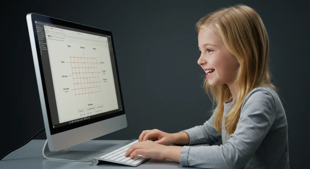
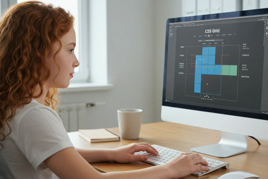
CSS Grid is a two-dimensional layout system — meaning it works in both rows and columns, just like a spreadsheet or graph paper.
Think of it like this:
If Flexbox is great for arranging items in one direction (like a row or column), then Grid is your full notebook page — perfect for designing complex layouts with both rows and columns!
🔧 Key CSS Grid Concepts
| Term | Description |
|---|---|
| Grid Container | The parent element that holds all grid items |
| Grid Items | The direct children inside the container |
| Grid Lines | The lines between rows and columns (used for positioning) |
| Grid Tracks | The space between two grid lines (a row or column) |
| Grid Cells | The smallest unit in the grid (where a row and column meet) |
| Grid Areas | Rectangular regions made up of multiple cells |
📦 Basic Setup
.container {
    display: grid;
    grid-template-columns: 200px 200px 200px; /* 3 columns */
    grid-template-rows: 100px 100px; /* 2 rows */
    gap: 10px; /* space between cells */
}
Now all direct children of .container become grid items, neatly arranged in a grid!
📐 Defining Rows and Columns
Example:
.grid {
    display: grid;
    grid-template-columns: 1fr 2fr 1fr; /* 3 columns with flexible widths */
    grid-template-rows: auto 100px; /* 2 rows */
    gap: 20px;
}
Common Values:
auto– Automatically sized based on content1fr– One fraction of available space200px,40%– Fixed or relative sizes
💻 Try This: Build a Simple Dashboard Layout with Grid
Let’s create a responsive dashboard layout using CSS Grid.
Step 1: Create a New File
In your VS Code project folder (MyFirstWebsite), create a new file named:
grid-dashboard.htmlStep 2: Add This Code
<!DOCTYPE html>
<html>
<head>
<title>CSS Grid Dashboard</title>
<style>
body {
margin: 0;
font-family: Arial, sans-serif;
}
.dashboard {
display: grid;
grid-template-columns: 2fr 1fr; /* 2 columns */
grid-template-rows: auto 300px auto; /* 3 rows */
gap: 20px;
padding: 20px;
min-height: 100vh;
}
.header {
grid-column: span 2;
background-color: #4CAF50;
color: white;
padding: 20px;
text-align: center;
font-size: 24px;
border-radius: 8px;
}
.main {
background-color: #f9f9f9;
padding: 20px;
border-radius: 8px;
}
.sidebar {
background-color: #e0e0e0;
padding: 20px;
border-radius: 8px;
}
.footer {
grid-column: span 2;
background-color: #333;
color: white;
padding: 15px;
text-align: center;
border-radius: 8px;
}
</style>
</head>
<body>
<div class="dashboard">
<div class="header">My Dashboard</div>
<div class="main">
<h2>Main Content Area</h2>
<p>This is where most of your data or information goes. It spans the main section of the dashboard.</p>
</div>
<div class="sidebar">
<h3>Sidebar</h3>
<p>Use this area for navigation, quick stats, or filters.</p>
</div>
<div class="footer">
© 2025 My Dashboard App
</div>
</div>
<p style="text-align: center; margin-top: 20px;"><a href="index.html">Back to Home</a></p>
</body>
</html>Step 3: Run with Live Server
Right-click the code → Show All Commands → Launch Live Server
🎉 You’ve built a clean, structured dashboard layout using CSS Grid!

🧪 Try It Yourself!
- Change the layout to have 3 columns and 2 rows.
- Use
grid-areato name sections like"header","main","sidebar", and"footer"and place them usinggrid-template-areas. - Make the sidebar fixed width and let the main content grow.
- Add a second sidebar below the first one and adjust the grid accordingly.
🤔 Grid vs Flexbox – When to Use Which?
| Feature | Flexbox | Grid |
|---|---|---|
| Dimension | One-dimensional (row or column) | Two-dimensional (rows + columns) |
| Best For | Navigation bars, cards, lists | Complex layouts like dashboards, forms, galleries |
| Control | Good for alignment and spacing | Full control over rows and columns |
| Responsive Design | Easy with wrapping | Powerful with media queries andfrunits |
🚀 Next Lecture Preview:
In Lecture 23, we’ll explore more advanced CSS Grid features, including grid-area, grid-gap, minmax(), repeat(), and responsive layouts — so you can build anything from photo galleries to full-page apps!
Stay Updated
If you found this information useful, don’t forget to bookmark this page and Share.
HTML5 and CSS3 Compleate Series
